A common error I see on web forms is people using checkboxes when they should be using radio buttons.
Radio buttons
Use radio buttons when you want users to choose just one item from a list.
For example:
What’s your favourite biscuit?
You might like many kinds of biscuit, but you can only have one favourite. Radio buttons are the correct input type here. They only let the user choose one answer.
Checkboxes
You should use checkboxes when you want to allow users to choose more than one answer from a list.
For example:
Which of these biscuits do you like?
You can like more than one type of biscuit, so checkbox is the correct input type.
Common errors with radio buttons and checkboxes
Using checkboxes for yes/no questions

This form uses checkboxes, meaning users can select both ‘Yes’ and ‘No’.
This is confusing and could cause problems when you process the data. If someone has ticked both ‘Yes’ and ‘No’, does that mean they do want to get the newsletter or not?
Whenever you are asking a yes/no question, you should use radio buttons instead of checkboxes.
Radio buttons that look like checkboxes
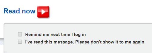
Nationwide shows an important message on its login screen.
It asks users if they want it to show the same message next time they log in.

The options above look like checkboxes because they are square rather than round. Many users have learned that checkboxes are square, and radio buttons are round. This is a norm of online publishing.
You can only choose one of the options above. But by using squares instead of circles, Nationwide risks confusing its users. This will add to the interaction cost of this stage of the transaction.
Key lessons about radio buttons and checkboxes
- Use radio buttons when you want the user to choose one option from a list.
- Use checkboxes when you want to allow the user to choose more than one item from a list.
- Use radio buttons for yes/no questions.
- Checkboxes should be square, while radio buttons should be circles.